
Black Friday Sale – Save 10% on all . Black Friday Sale – Save 10% on all licenses
Want to create stunning text effects in Adobe Illustrator? Many believe that mastering text effects in Illustrator requires years of experience and hours of tutorials.
However, with a few key techniques and a strategic approach, it’s possible to achieve impressive results quickly and efficiently. This guide outlines exactly how to do it.
Creating stunning text effects in Adobe Illustrator can transform your designs from ordinary to extraordinary. Mastering Illustrator text effects, such as using the Appearance panel and diving into the array of graphic styles available, can significantly enhance your projects.
You’ll find that Adobe Illustrator text effects offer various options, allowing for creative and eye-catching results that elevate your work.
Whether you’re following a text effects tutorial or experimenting on your own, understanding the principles of text design in Illustrator is crucial.
Illustrator also offers text effect plugins, which can streamline your workflow and expand your creative toolkit. With practice, these skills will enable you to produce professional-grade visuals with ease.
Delving into Illustrator text effects means understanding the underlying mechanics of how they work. By learning some foundational principles, you can combine various effects to create unique styles that cater to your specific project needs.
Mastering text effects requires patience and practice, but the flexibility of Illustrator ensures that you’ll find a satisfying depth to explore your creativity. Each effect you apply can make a significant impact, transforming simple typography into visually compelling graphics.
The power of Illustrator text effects lies in their versatility and scalability. By using Adobe Illustrator, you can create scalable vector graphics, ensuring that your designs remain crisp and clear at any size.
This is particularly beneficial for logo text effects and other branding materials where clarity is essential. Text effects make your designs more eye-catching and engaging, helping to draw attention and convey the intended message effectively.
The capability to create intricate and professional text effects garners impressive results, giving your work a polished and innovative appearance.
A well-organised workspace is the foundation for creating stunning text effects with Illustrator. The way a workspace is set up has a significant impact on productivity and creativity. Let’s explore how you can customise your workspace for optimal text design.
To start with Illustrator text effects, understanding some essential tools is key. First, the Type Tool enables users to select and manipulate text elements with ease.
The Appearance panel provides control over multiple effects and fills, allowing you to experiment with different styles without altering the text frame.
The Graphic Styles panel enables you to save and apply complex styles in a single click.
Meanwhile, the Pathfinder panel assists with shape combinations and text outlines, which are crucial for more intricate designs.
With these tools, achieving professional text effects becomes more manageable.
Customise your workspace by rearranging panels so that frequently used ones, such as Layers and Character, are easily accessible. Personalising toolbars with an at-a-glance view of the “Text” and “Transformation” tools will help quicken the workflow.
Keyboard shortcuts are another game-changer; setting them up for frequent actions, such as zooming and grouping, saves precious time. This customisation not only streamlines one’s process but also keeps one’s creativity flowing uninterrupted.
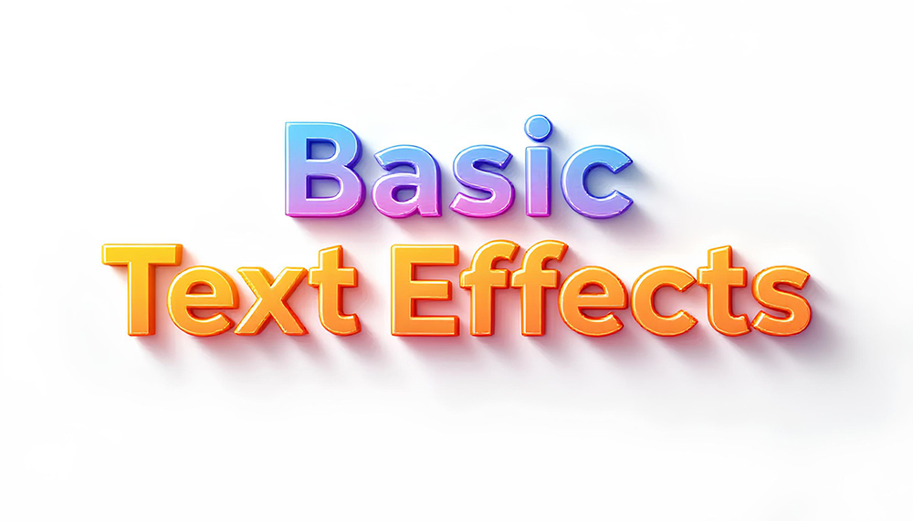
Some people think initially that mastering Illustrator text effects requires extensive experience, but it’s surprisingly accessible with a focused approach. Creating basic text effects serves as the foundation for more complex designs.
Mastering the basics of typography is essential for creating stunning text effects in Illustrator. It begins with understanding different font families and weights, as these influence the text’s visual impact.
The synergy between typeface and effect can define the success of a design project. Learning about kerning, leading, and tracking becomes essential, as these adjustments significantly influence readability and aesthetics, particularly in complex designs.
Embracing these typography principles helps ensure that one’s text effects in Illustrator convey the intended message effectively and beautifully.
The drop shadow effect is a staple in Illustrator’s toolkit, perfect for injecting dimension and contrast.
The key is to find the right balance, ensuring that your drop shadow enhances rather than overpowers your design.
Gradients are exceptionally versatile, offering a way to blend colour smoothly across your text, bringing sophistication to the forefront.
Utilising gradients can elevate your project, allowing colours to transition seamlessly, adding both flair and depth to your text. This subtle enhancement is perfect for creating visually compelling text effects.
Ensuring that your text blends smoothly with its background is a skill that can make your designs appear highly professional.
As these basic techniques demonstrate, impactful text effects in Illustrator don’t require advanced skills. Instead, a well-grounded understanding of these foundational elements can pave the way for more complex design adventures.
Getting comfortable with intermediate Illustrator text effects unlocks a range of possibilities in your design projects. These techniques aim to make your text more engaging and impactful, perfect for capturing attention in graphic design.
Masks can transform text effects in Illustrator, elevating your creations with intricate patterns and dynamic visuals. When applying masks, you use one object to reveal parts of another, achieving unique visibility effects.
This is particularly effective for logos or headlines that need a creative boost.
Infusing text with patterns and textures in Illustrator is a powerful way to add depth without overwhelming simplicity.
This technique is a fantastic way to create robust, eye-catching elements that stand out in marketing materials.

Creating advanced text effects in Adobe Illustrator can be a game-changer for your design projects. Whether you’re crafting eye-catching logos or enhancing graphic design for various media, mastering text effects in Adobe Illustrator adds significant value to your work.
Illustrator provides powerful tools for creating layered gradients, detailed shadows, and intricate animations. Understanding these functionalities will allow your designs to stand out, attracting the attention they deserve.
Bringing text to life with 3d text effects in Illustrator opens new dimensions in design.
Although the mechanics are straightforward, these elements can inject vibrancy and realism into any design project. This is particularly valuable in logo design, where depth in text can significantly contribute to brand identity.
Creating a 3d Line Text Effect in Illustrator can add depth and dimension to your design work. The process leverages the 3d text effects available in Illustrator, offering multiple options to create a layered, dynamic look.
Vintage and retro text effects are timeless design elements that can give your projects a unique charm and nostalgia. To design these styles in Illustrator, start by choosing a retro-inspired typeface.
Fonts with thick lines and rounded edges often convey the essence of bygone eras. Once your text is set, the real magic happens through the use of effects and layering techniques.
Illustrator’s effects, such as ‘Roughen’ or ‘Grain,’ can simulate the worn look of vintage prints. Combining these with colour palettes reminiscent of past decades—like muted tones or bright, clashing colours—can completely transform your design.
Text effects in Illustrator allow you to convey your message in dynamic and visually engaging ways. Experimenting with these effects not only sharpens your skills but also enhances the overall impact of your designs. Remember that balance is key; knowing when to use an ornate text effect and when to opt for simplicity will elevate your work.
Creating stunning text effects is more about avoiding pitfalls than executing a design perfectly. One common mistake is overloading a design with too many effects, leading to visual clutter.
A clear focus on the intended message should inform your choices. Overuse of effects can distract rather than enhance.
Another frequent error is neglecting to consider how text effects will appear on different screens or print mediums. Always preview your designs in the target format.
For instance, a text effect that looks vibrant on a large monitor might lose clarity on a small mobile screen, and vice versa.
Be mindful of readability. The greatest text effect loses impact if readers struggle to grasp the text itself. As you experiment, ensure that the visual enhancement complements rather than obscures the message.
Text design trends evolve, and staying informed is crucial for keeping your designs current and relevant. Monitoring industry trends can inspire fresh ideas and keep your work competitive. Consider joining creative communities or subscribing to design blogs to get the latest updates.
Ultimately, mastering text effects in Illustrator involves continuous learning and adaptation. The ability to create stunning visuals is not just about proficiency in software; it’s about developing an eye for design and nurturing your creative intuition.
Anyone supporting students in higher education has noticed how visual their coursework has become. Nowadays, posters, infographics, social posts, and even short videos have become part of the academic load. ....
Using Bulk Sending of Fixed-Term Agreements at Eduvos Efficiency is a term commonly used in business. But why is it such a desirable outcome? Simply put, efficiency allows workers to ....
How Adobe Express is Poised to Empower Entrepreneurship Students at Redeemer’s University The story of Redeemer’s University’s adoption of Adobe Express began at the Association of African Universities (AAU) Conference ....
If the challenge is that degrees are no longer enough, the opportunity is that skills are becoming the new currency of the global economy. The World Economic Forum argues that ....
Each year, across Africa, vast numbers of graduates leave tertiary institutions in the hope of finding work. However, the promises offered by higher education soon collide with the hard reality ....
When Dr. Sean Kruger, Doctor of Business Management at UP, introduced Adobe Express into his third-year business management module, his goal was clear: shift student outputs from traditional static documents ....
Adobe Acrobat AI Assistant Evaluation Report We invited Mr. Wendal Koopman from the Faculty of Informatics and Design at Cape Peninsula University of Technology (CPUT) to test Adobe Acrobat AI ....
Adobe Acrobat AI Assistant Evaluation Report We recently asked Miss Thobile Mtshali, a Senior Laboratory Technician and Laboratory Manager at The University of the Witwatersrand, to explore and rate ....
Unlike casual web browsing or simple document skimming, academic fact-finding is all about rigorous evaluation. It’s not enough to find an answer; it must be the right answer, backed by ....
Every academic has faced that moment of frustration when key notes are scattered across different documents, references are here, there and everywhere, and that important citation is nowhere to be ....
Writing is one of the toughest hurdles in the academic process. Unlike casual communication or straightforward documentation, scholarly writing requires that academics be precise, coherent, and bring intellectual depth. ....
Designing your own mobile app might sound intimidating, but with Adobe XD, it’s surprisingly achievable. Whether you’re a complete beginner or someone switching from another tool, XD helps turn your ....
“The Assistant helps break down complex terminology and highlight relationships between key concepts, which is especially helpful when dealing with dense theoretical frameworks.” Jacques Le Roux, Chief Operating Officer | ....
“Educators are naturally creative when it comes to delivering knowledge, and Adobe Express makes this process even more seamless.” Mr Mahomed Sheik, a Support Consultant in the IT Department at ....
“Adobe Express allows students to design professional-quality content easily, making it accessible for everyone, regardless of their design experience.” Mrs Nomfundo Zwane, an Associate Lecturer in Digital Animation at Nelson ....
“Adobe Express is easy to learn and is more targeted to specific user needs. So, it’s quick to teach, if teaching is even necessary.“ Tanya Pretorius is a trainer at ....
Honoris United Universities is the largest private pan-African higher education network, serving over 100,000 students across 76 campuses in 26 cities and 16 institutions. This institution is powerfully mission-driven, and ....
Quickly mark, track, and validate critical documents with customisable stamps that enhance visibility, compliance, and efficiency. Stellenbosch Business School Executive Development (SBS-ED) faced a challenge: ensuring the security and authenticity ....
Adobe Express for higher education is the all-in-one creative app that empowers students of all skill levels to make anything they dream up for presentations, reports, and other class projects—all ....
The new world of work is here, and the modern employee cannot thrive without the creative and artificial intelligence (AI) skills needed to succeed. When a skill becomes essential in ....
Managing design assets across multiple Adobe apps feels chaotic—a constant juggling act between files and programs. But what if I told you there’s a secret weapon designers are using to ....
Veer Gosai, Second Year BSC Geoinformatics with Computer Science Student, Stellenbosch University. “AI Assistant is useful for organising information by categorising key points and structuring assignments logically, making the writing ....
Looking to turn your sketches into professional vector logos using Adobe Illustrator? This guide walks you through each crucial step, from initial rough sketches to final polished designs, highlighting the ....
A Case Study on Adobe Acrobat Sign In a moment when digital transformation is not just a luxury but a necessity, finding the right tools to bridge gaps and enhance ....
According to Stefania Giannini, UNESCO Assistant Director-General for Education, “The future of Africa is inextricably linked to the future of the world. With the youngest population globally, over 400 million ....
AI in classrooms is here to stay. Whether it’s being used for personalised learning platforms, automated assessment systems, or creative software, the age of generative AI has arrived. However, despite ....
Creative Cloud’s Adobe AI tools are transforming modern design workflows by automating repetitive tasks and enhancing creative capabilities. This article explains how Adobe Creative Cloud’s AI tools, like Adobe Sensei, ....
As young graduates enter the workforce, digital literacy is a requirement they cannot afford to ignore. It’s almost impossible to believe, but for every digitally reliant profession today, there was ....
“Generative AI tools are valuable allies in the creative process, serving as collaborative partners that can enhance rather than replace human creativity.” Chats Devroop is a Research Professor in the ....
Africa faces a significant digital divide that urgently calls for action from many stakeholders, not least of all forward-thinking software companies like Learning Curve, which delivers innovative initiatives tailored to ....
Facing issues with Adobe Acrobat? This article offers direct solutions for troubleshooting common issues in Adobe Acrobat, such as slow performance, crashes, and printing errors. Find the fixes you need ....
Adobe Express helps you create professional visuals and videos with ease. Learn about its user-friendly tools and integration with Adobe Creative Cloud in this guide to exploring Adobe Express’s key ....
Looking to save time on PDF editing with Adobe Acrobat? You’ve come to the right place. In this article, we’ll share the top 10 Adobe Acrobat tips to save time ....
Looking to make your Adobe Premiere Pro workflow fast and smooth? This article covers essential things you should learn for a quick and smooth workflow to boost your editing efficiency ....
If you want to edit a PDF in Adobe Acrobat, this beginner’s guide is here to help. You’ll learn how to start editing text, images, and more. Let’s get you ....
Need to track and manage signed documents effectively in Adobe Acrobat Sign? This guide covers everything from monitoring document statuses to organising agreements using the platform’s powerful features. Learn how ....
Regardless of their discipline, many academics know the familiar feeling of rushing to prepare for a lecture with an endless stack of ungraded assignments looming in their minds. As an ....
Adobe Creative Cloud provides access to essential creative tools, seamless app integration, and a wealth of learning resources. It’s designed to help you grow your skills and realize your creative ....
Wondering why your Photoshop files are so large? Reducing file size without losing quality can be crucial for your workflow. Photoshop files can become unwieldy due to high-resolution images, multiple ....
Adobe Acrobat’s Preflight tool is essential for print professionals seeking high-quality print outputs. It checks PDFs for errors, ensures compliance with standards, and helps fix issues. In this guide, we ....
This overview covers everything you need to know about enhancing photos with Adobe Creative Cloud‘s Lightroom, from basic adjustments to advanced techniques. Learn how Lightroom’s tools and features bring out ....
Mastering advanced layer management in Photoshop is vital for ensuring a streamlined and efficient workflow in complex design projects. This article covers essential techniques, such as grouping layers, colour coding, ....
This guide covers how to tailor panels, tools, and settings in applications like Photoshop and Premiere Pro. By the end, you’ll know how to create an efficient setup that makes ....
Introduction In today’s fast-paced business environment, efficiency and streamlined processes are crucial for success. It’s no secret that organisations strive to significantly improve their operations in document management and signing ....
A Comprehensive Remote Collaboration Solution Adobe Creative Cloud is a robust creative platform that enables seamless collaboration among team members. By leveraging cloud-based technologies, Creative Cloud empowers designers, artists, and ....
In the age of online teaching and learning, it has become commonplace to allow students to compile and submit written assessments of many kinds online. Most online learning management systems ....
In today’s digital environment, the capability to present information clearly and professionally is essential. This article examines the functionality of Adobe Acrobat Pro, the significance of customising PDF layouts and ....
The demand for efficient and secure document signing has reached unprecedented levels in the digital landscape. E-signature solutions have emerged as transformative tools, streamlining business and individual processes. Among the ....
In today’s digital landscape, ensuring the accessibility of PDF documents is vital for reaching a wider audience, especially individuals with disabilities and those who use assistive technology like screen readers ....
Adobe Creative Cloud (CC) has transformed how video editors approach their craft, offering powerful tools that streamline post-production workflows and enhance media asset management. This article covers the benefits of ....
In today’s digital age, using reliable methods for signing documents, such as electronic signatures, is crucial for individuals and businesses. It ensures compliance and document security. Adobe Acrobat Pro is ....
In the fast-paced world of photography, mastering Photoshop tools is essential for transforming your images from good to stunning. This article explores the significance of Photoshop for photographers and introduces ....
In today’s fast-paced work environment, efficiency is key, especially for administrative professionals juggling multiple tasks through automated workflows. Adobe Acrobat Pro is a powerful tool that can transform how you ....
In today’s fast-paced business environment, efficiency is critical, and managing contracts should be a smooth process, especially when it comes to signing contracts digitally. Adobe Sign is a powerful tool ....
Thanks to generative AI, today’s content creators can push the boundaries of what’s achievable. However, this rapid advancement also brings with it some challenges, especially around AI ethics and the ....
Redaction is crucial in protecting sensitive information within documents, especially in legal and corporate settings. Understanding the importance of proper redaction becomes essential as we navigate the complexities of information ....
In the world of graphic design, Adobe Creative Cloud stands as an essential toolkit for both budding designers and seasoned professionals. This comprehensive suite of applications offers powerful resources like ....
AI has democratized content creation. Now, anybody, regardless of their digital skills, can produce amazing creations. In the education field, this is empowering for both educators and students. At the ....
Are you looking for efficient strategies for archiving your documents using Adobe Acrobat Pro? This guide dives into the best practices for archiving documents in Acrobat Pro, focusing on preparing, ....
Are you eager to start creating stunning digital artwork from scratch in Photoshop? You’re in the right place. This guide covers everything you need to know, from essential tools to ....
Creating interactive forms with Adobe Acrobat Pro can transform static PDFs into dynamic, fillable documents. This article will teach you how to add interactive elements like text fields, checkboxes, and ....
Do you need to reduce the file size of your PDFs? Adobe Acrobat Pro offers several powerful tools to help you optimise PDF file sizes. This article will walk you ....
Are you an Adobe Creative Cloud user eager to unlock hidden features to enhance efficiency, creativity, and productivity? This article will guide you through exploring features initially hidden from view ....
For many years, the most successful students were those who could recall the most information and reproduce those facts in an examination room. Today, assessments are undergoing a profound transformation, ....
Administrative tasks and enrolment processes can be daunting for educational institutions. Adobe Sign for Education simplifies these by digitising forms and automating workflows. This article explores how Adobe Sign for ....
The role of AI in Adobe Creative Cloud marks a new era for creatives. With intelligent design automation, advanced editing capabilities, and seamless cross-app integration, AI is redefining the creative ....
Creativity has always been important in business, but now it’s more crucial than ever. It’s no surprise that it has emerged as a vital skill in modern organisations. According to ....
Are you looking to edit, read, or manage PDFs on the go? Adobe Acrobat Mobile brings the desktop editing experience to your Android device, providing a simple way to work ....
Adobe Creative Cloud integrations can streamline your creative process immensely improving efficiency and enhancing team collaboration. This article cuts through the complexity to deliver straightforward examples for harnessing the full ....
Are you looking to reduce manual, repetitive PDF tasks? Learn how automating workflows with actions in Acrobat Pro can boost efficiency and precision. We’ll walk you through using the Action ....
Diving into Photoshop can be overwhelming, but mastering the basics is your gateway to creating stunning visuals. If you’re starting out, you may wonder which tools are essential to learn ....
The quest for going green: the environmental impact of switching to Adobe Sign is leading businesses to adopt this technology and the environmental impact of this switch is significant. Organisations ....
Adobe Creative Cloud (CC) isn’t just a set of tools; it’s a collaboration powerhouse. This guide reveals how to make the most of its teamwork, asset management, and project synchronisation ....
Imagine being trapped in a process marked by constant delays, where completing essential forms becomes a test of patience. Documents are hard to find, many go missing forever, and there’s ....
Are you looking to transform your PDFs from simple text documents into interactive experiences? Adobe Acrobat Pro offers a suite of tools that allow you to go beyond text, adding ....
Want to master photo revitalisation? No worries, we’ve got you covered! This article delivers the know-how for you to expertly navigate Photoshop’s tools and reclaim the narrative of your visual ....
Documentation is the foundation of today’s business and learning environments. Portable Document Format (PDF) is an essential part of this process. It is estimated that over 3 trillion PDFs are ....
Signing documents for acknowledgement or agreement is commonplace in various organisations worldwide. However, physical signing is one of those curious productivity traps that still takes far too long in many ....
Maximising Efficiency with Adobe Sign for Remote Work: Ensuring Workflow Continuity How does Adobe Sign for remote work ensure workflow continuity when teams are scattered across locations? This article will ....
Stepping into the Adobe Creative Cloud can be daunting for beginners. With a vast array of powerful apps at your fingertips, knowing where to start and how to harness these ....
As the digital workspace constantly evolves, redefining document security has become critical. The integration of Acrobat and MS 365 leverages their combined strengths, creating a formidable defence against unauthorised access ....
Graphic design can be a challenging profession with many hurdles to overcome, and newer Graphic Designers can have a hard time starting out this career. Here we have graphic design ....
The landscape of higher education is changing rapidly. Digital tools are impacting how educators teach and how students learn. The pace of learning is faster in business schools than anywhere ....
Are you thinking of starting a side hustle? Do you have some form of skill with Adobe programs? Then look no further than here! This article reveals five innovative ways ....
Videographers constantly seek new ways to polish their craft, and Adobe Creative Cloud’s toolkit is a pivotal resource. From refining raw footage with Premiere Pro to adding final touches in ....
Need help picking the perfect app from the Photoshop family for your photo tasks? In this article, we dive into the diverse apps available, pinpointing precisely which app aligns with ....
Getting a degree has always been the apex of educational achievement and a passport to professional success. Degrees would often guarantee jobs, and good jobs at that. However, today, a ....
The dynamics in the modern classroom are changing all the time. What remains constant is that educators must keep striving to make their lessons more engaging. Educators can create a ....
Continuous learning is the career catalyst everyone needs. Regardless of your field, you must adapt, innovate, and cultivate new skills to stay relevant in the workplace. Skillshare is a transformative ....
Data is the new currency for decision-making. This is why an ever-increasing demand for robust and accurate data analysis exists. However, with mountains of data comes the equally big challenge ....
The next frontier of digital creativity is here with Adobe Substance 3D, the cutting-edge suite explicitly designed for creators who want to continue pushing the boundaries of art. Adobe Substance ....
Adobe’s innovative products significantly enhance productivity and efficiency in the legal industry, particularly in South Africa. Adobe Sign, a key component of Adobe Acrobat Pro, offers streamlined, secure, and legally ....
Deciding between Adobe Creative Cloud Teams vs Individual for business can significantly impact your workflow and budget. Are you seeking the flexibility for a collaborative team or the tailored control ....
Document security is no longer just a concern for financial institutions or government agencies; it is crucial for all businesses in today’s digital world. Document security involves safeguarding sensitive or ....
From graphic design to video editing and an ever-growing list of non-creative disciplines, for that matter, Adobe Creative Cloud provides access to an array of professional-grade applications that can elevate ....
In today’s fast-paced digital world, choosing the right design software can make all the difference in creating stunning visuals that captivate your audience. Adobe, a leader in the design industry, ....
In today’s digital world, the security of sensitive information is of paramount importance. As PDFs have become the go-to format for sharing documents, reinforcing document security with Adobe Acrobat is ....
In today’s digital environment, businesses and individuals increasingly rely on electronic signatures (e-signatures) to streamline document workflows, reduce paper waste, and save time. Deciding on the best digital signature solution ....
Design work is a delicate dance between creativity and productivity, with each step impacting a project’s overall success and efficiency. Striking the perfect balance can seem elusive, but it is ....
At a time when digital transformation is not just a luxury but a necessity, finding the right tools to bridge gaps and enhance efficiency is crucial. Adobe Acrobat Sign is ....
Learning Curve is humbled to announce been appointed by world class anatomical software firm Primal Pictures as its sole agent in Australia! This comes after a highly successful and ongoing ....
The changing landscape of education calls for tools that not only make content creation easier but truly empowering for educators and students. Welcome to Adobe Express — a tool where ....
South Africa produces many thousands of high school and tertiary graduates, all eager to enter the job market. Most end up frustrated by a lack of opportunities. However, in a ....
Creative people often struggle with the question: “I’ve created these digital assets, now what?” If this is you, it’s time to embrace your dual identity as an artist and an ....
In an ever-evolving world, the importance of cross-cultural collaboration and knowledge exchange cannot be overstated. This rang true for Learning Curve, a pioneering company in the field of digital education, ....
Digital transformation is inevitable for businesses of all sizes, but it’s often easier said than done. Deloitte discovered that operational challenges in digital transformation are the top concern for directors, ....
Women’s Month is celebrated every year in August in South Africa to pay tribute to the more than 20,000 women who marched to the Union Buildings on 9 August 1956 ....
That’s why it’s a good idea to take a break from your digital devices every now and then and do a digital detox. A digital detox is when you purposely ....
There was a time when doctors could not view the inner workings of the human body without performing invasive surgery. In early history, the only way for anatomists to study ....
Bridging digital literacy gap one licence, at a time. According to the World Economic forum (WEF), over 1 billion jobs are set to be transformed by artificial intelligence (AI) technology ....
Artificial Intelligence (AI) has the potential to revolutionize the way we live our lives, and one sphere that promises to benefit enormously from the power of AI is healthcare accessibility. ....
Meta, the company behind Instagram and Facebook, has launched a new social media platform called Threads. The app is designed to rival Twitter and was launched on the 6th of ....
The future is here and Adobe Firefly Generative Al is leading the innovation drive. The latest edition to the Generative AI family is Beta Photoshop. The history of Photoshop dates ....
The Adobe Firefly Gnerative Ai features are here and ready to completely revolutionise the way creators and customers experience Adobe Creative Cloud, Document Cloud, Experience Cloud and Adobe Express. Adobe ....
SWITCH & EARN As SA’s foremost Adobe Platinum Reseller we are honored to be the first digital solutions provider to launch our VIP Marketplace – an innovative and efficient customer ....
According to the Banking Association of South Africa, Small and Medium Enterprises (SMMEs) comprise 91% of formalised businesses, offering 60% of the labour force and contributing roughly 34% of South ....
According to LinkedIn data which tracked job listings over two years, remote work peaked in March 2022 with more than 20% of 60 million job postings on the site offering ....
‘Digital document collaboration’ is made easier by Adobe Acrobat Pro – take your paperless systems to another level by optimising e-signatures, PDF document sharing and APIs integration. Digital transformation has ....
Adobe Photoshop is making it easier for you to realise your creative dreams with its ever-evolving yet easy to use features. Photoshop previously reserved for the editing pros is now ....
Adobe Express is the leading web and mobile app that offers a wide -range of “education-focused templates” with “easy-to-use tools” that elevate all teaching materials. Common Sense Education recently dubbed ....
Film in South Africa has taken some incredible strides at both industry and educational level, with the growing international film acclaim and the film schools pioneering these advancements by fostering ....
Every year in South Africa hundreds of thousands of young people leave secondary schools and tertiary institutions with high hopes of finding a job. Only a few are successful. According ....
Adobe for Education empowers institutions to get the most out of students by offering world-class digital software. In this constantly evolving digital world equipping students with the digital skills to ....
Adobe brings the expansive Adobe Acrobat PDF features to all Microsoft Edge users. The Adobe x Microsoft ‘phased feature rollout’ has commenced with the addition of Adobe Acrobat PDF features ....
Adobe offers registered Non-profit organisations discounted pricing under Adobe Value Incentive Program (VIP) licensing. Adobe drives the complete digitalisation of your organisation, allowing you to conveniently tackle day-to-day administrative tasks ....
The power of PDF plus unlimited eSignatures, in one app. Over the last few years, Adobe have added significant value to Acrobat Pro – from deeper Microsoft integrations and optimised ....
In today’s world, new online productivity tools are being developed every day and it’s easy to forget just how difficult it was to perform jobs that can be done today ....
Adobe Acrobat 2017 was released on June 6th, 2017 and in line with Adobe’s Support Lifecycle Policy, product support will cease on June 6th, 2022. What does “end of support” ....
Adobe Stock is undoubtedly the leading marketplace for creatives. It’s advanced search feature and seamless integration with Creative Cloud are just two of many reasons Adobe Stock for teams is ....
Numerous studies, including ones from the US Department of Education, World Economic Forum, and Bloomberg indicate that tomorrow’s jobs will demand “creative problem solving skills.” But what exactly are creative ....
“The student of the future is what we call a maker, somebody who not only understands the problem, but also produces solutions to it.” Over the past 50 years we ....
The next chapter in education In education, times are changing faster than ever before. Engaging experiences are critical to help students and employees differentiate, grow and thrive in an environment ....
New apps, new features, and faster, easier ways to work together. The latest release of Creative Cloud for teams is here, and it’s packed with new apps and features designed ....
It’s never been easier to turn your inspiration into endless creativity! Turn your inspiration into stunning creations with powerful, easy-to-use software. Discover automated editing, step-by-step guides, effortless organisation, fun ways ....
In line with the Adobe Support Lifecycle Policy, end of product and technical support for Adobe Acrobat 2015 and Adobe Reader 2015 officially ended on 7 July 2020. What does ....
As marketers, you’re well aware of the value of creating, publishing and sharing content that increases awareness of your brand. Are your teams struggling to come up with fresh ideas ....
Organisations around the world are transforming their businesses thanks to digital technology programs like Adobe Sign. The power of an end-to-end digital experience allows you to replace traditional paper and ....
The unprecedented pandemic that the world is going through at the moment has put an unbelievable strain on people’s lives as they know it. This has resulted in a ....
Overnight, educators and students around the globe have had to quickly transition from in-class learning to remote home learning. While the transition to distance learning brings rewards, it also brings ....
As we adjust to a continually changing educational landscape and embrace the idea of distance learning – which has suddenly moved to the forefront of our teaching practice – many ....
Stay Connected, Stay Productive. Social media marketing is a lot like working out. It takes discipline and results are never instant. Now more than ever however, it is critical that ....
It’s back like the Terminator! – A repeat of the ‘Summer Sizzling Deal’ Adobe made available in February this year! And at the same LOW price! From the 8th November ....
Adobe Illustrator App Could Roll Out To IPads In 2020 Photoshop is not the only Adobe app to come to iPads. Adobe’s suite of creative software that are originally accessible ....
Warning: If you use an older Adobe app, don’t install MacOS Catalina Apple launched its MacOS Catalina operating system on October 7, complete with lots of new features and improvements. ....
Adobe Introduces Customer Journey Analytics for Its Adobe Analytics With Customer Journey Analytics, teams could bring in new data sets such as in point-of-sale systems and call centers to produce ....
Adobe adds Auto Reframe to Premiere Pro for quick vertical video Adobe is adding a new feature to its Premiere Pro desktop video editing app to make creating content for ....
Adobe Announces The Update to the Lightroom Ecosystem We’ve Been Waiting For! Today, Adobe announced updates to the Lightroom ecosystem, including GPU-accelerated editing in Lightroom Classic and Camera Raw, providing ....
Adobe Premiere Rush supercharges video speed adjustment Adobe Premiere Rush, Adobe’s cross-platform video editor for smartphones, tablets, and PCs, arrived on select Android devices in May following a broad launch ....
Adobe Lightroom is now on the Mac App Store The first major Adobe app has arrived on the Mac App Store. The first major Adobe app to be available on ....
Adobe Fresco brings painting to the iPad Do you like to be creative on your iPad? Adobe brings Fresco to Creative Cloud, so you can paint wherever you want. Adobe ....
New Technology Can Detect Photoshopped Fakes, Even Reveal the Original Images Photoshop is arguably the most powerful tool at a photographer’s disposal. And like many powerful tools, it can be ....
Acrobat Pro DC: Adobe’s PDF software is still the one to beat A feature-packed solution for professionals Since its development back in the 1990s, the PDF has gone on to ....
Premiere Rush, Adobe’s video-editing app for YouTubers, is now available on Android Adobe’s Premiere Rush CC, which arrived on the desktop and iOS last October, is now available on Android. ....
Adobe Brings about Significant Changes to an Almost Perfect CC Lineup NAB show started way back in 1923, about 96 years ago. Held at the Las Vegas Convention centre, it ....
Adobe Creative Cloud Updates Adobe today announced performance updates and new innovations for video and audio tools in Adobe Creative Cloud, all designed to improve efficiency in video production. What’s ....
Adobe brings content-aware fill for videos to After Effects Adobe today announced that it is bringing content-aware fill to After Effects, the special effects software that is part of its ....
Adobe has just announced the release of Photoshop CC 20.0.4. This update includes fixes to some of the top customer reported issues and other bug fixes. Here is a list ....
Adobe has just announced the release of Photoshop CC 20.0.4. This update includes fixes to some of the top customer reported issues and other bug fixes. Here is a list ....
In our last article, we shared the latest enhancements available on Adobe XD CC 2019 from a design point of view, but as you probably already know, XD isn’t limited ....
It’s February, the hottest month of the year in South Africa and Adobe has a Summer Sizzling Deal to match. At the beginning of March 2019 Adobe creative Cloud for ....
What’s not to love about Adobe XD? This powerful tool helps us to design, prototype and share. The good news is, it just got better. NEW FEATURES & UPDATES AVAILABLE ....
The Adobe Max Conference held in October 2018 was nothing short of spectacular. So many things to look forward to, but even more things made available now. New features and ....
In our last article we covered the features and updates made to Adobe Dimension CC 2019. Today, we’ll have a look at the new features and updates available in Adobe Photoshop CC ....
Now that we’ve covered the Max Sneaks, we’ll be sharing the new features and updates for Adobe Creative Cloud 2019, that were announced at the Adobe Max Conference. There are many ....
We recently shared with you 5 Adobe Max sneak peeks from the 2018 Adobe Max conference held in LA. These included Brush Bounty, Project Fast Mask, Moving Stills, Smooth Operator ....
This year at Adobe Max conference, which was held in Los Angeles from 15-17 October 2018, Adobe gave us sneak previews of a few new tools, apps and enhancements that ....
Another day and another gigantic purchase to the value of $4,5 billion. Adobe is set to acquire Marketo as part of its ongoing strategy to dominate the enterprise marketing space. ....
If you are in the commercial or government sector, then we have a very exciting announcement for you! Adobe has put together a truly sweet deal, but it is only ....
It has recently been reported that Adobe would no longer be supporting older operating systems with their new release of software. This has naturally led to a number of people ....
Do you remember what it was like to remove unwanted things from photos in Photoshop before they developed the ‘Content Aware’ feature?For those veterans who have been around for a ....
Frequency Separation has been around for a long time but has received a bad reputation in the past. This is not because there is anything wrong with the software. It’s ....
If you thought that the only way to create a striking presentation was by using MS PowerPoint, we wouldn’t hold it against you. Few people know that you can create ....
Adobe Acrobat has made it a lot simpler to work in teams, no matter where we are in the world or which devices we’re using. It enables us to create ....
Since it debuted in the 90’s, Photoshop has undergone a innumerable advancements. Since it was initially sold with Barneyscan-branded scanners, it was almost named Baneyscan XP, but that all changed ....
Earlier this month, Adobe released the preview of their new AR (augmented reality) authoring tool and multi-platform system called Project Aero. Using immersive technology, this interface blurs the line between ....
Custom-built to provide UX (user experience) designers with an optimised design process, Adobe Experience Design CC, more commonly referred to as Adobe XD, is a powerful software medium used to ....
It is almost mid-June 2018, so you may be wondering why we would choose to talk about what’s new in Adobe CC 2018 now. Well, it seems that there are ....
Adobe Max is an in-your-face, larger-than-life, all-guns-blazing annual celebration of creativity, which this year descended on Vegas. It’s Nice That was invited by Adobe, with over 12,000 other creative minds ....
Not too long ago, if asked what Adobe had in common with Shopify, the answer would be “nothing”! After all they aren’t even in the same market space. Adobe is ....
Primal Pictures now brings you PALMs, catering for your specific learning needs and adapting learning to improve your retention and outcomes. What is PALMs? PALMs stands for Perceptual and Adaptive ....
Adobe Photoshop has always been one of the most popular suites available for editing photos, thanks to its array of useful features that allow users to correct color, resize, crop, ....
Imagine having the convenience of calling on ‘Siri’ or ‘Bixby’ (for the Samsung enthusiasts) to assist you through the processes of your next Photoshop project. Well, this has been an ....
Pre-orders now open! Learning Curve are excited to announce pre-orders for the Adobe Creative Cloud Suite can now be placed! Place your order with us before the 28th February 2018 and ....
Video observations that strengthen and inform Swivl™ is a multi-purpose robotic motion platform, which will allow you to self-capture video. The robot enhances video capture by wirelessly following the movement ....
Creative Suite software has not been updated since April 2012, yet many Adobe users have still not made the move to Creative Cloud. With thousands of new features available and ....
Staggering 33% of installed software is not licensed. Last year South African companies coughed up more than R3.64million for using unlicensed software. This is according to the BSA, who in ....
As predicted, Adobe have officially announced all Creative Suite (CS) perpetual products will no longer be supported from May 2017. Learning Curve, Africa’s only Platinum reseller are here to guide ....

“I’m always seeking the next big thrill”
Me in a word: Exploratory
The first 21 years of my life were a mix of travel, sports and chasing academic excellence. As a child, I enjoyed jet skiing, bungee jumping and a few venomous pets. I’m still always seeking the next big thrill, like rock climbing and cave exploration.
Since leaving university and surviving the COVID years, I’ve developed my skills across different fields, from education to private healthcare, with a keen interest in human biology and education.
To relax, I watch old war movies or series, and shows like Sons of Anarchy and The Wire. Cooking was a big part of my childhood and I’d always help my parents prepare meals. I’ll bake anything with chocolate!
My wilderness survival buddy would be my dad. He’s a DIY expert, with basic wilderness survival skills. I once had a narrow escape outdoors: Venturing off the path on a solo hike, roasting in midday sun, suffering from dehydration, leg cramps and an encounter with a juvenile cobra. (I survived.)
Some everyday things that really annoy me are the morning traffic rush – and people being indecisive at the drive-thru window.
My bucket list destinations? Thailand, for rock climbing and base jumping, and Burma, for Lethwei (Burmese bare-knuckle boxing).
I think the human race needs a greater focus on work-life balance. Spending more time enjoying the little things, whether sport, art or music would help everyone live better, more fulfilling lives.
If I could change the law, I’d ban farm-raised lion hunting, and I’d allow a years’ paid parental leave for all new parents.
Outside of work, I juggle sports, cooking and taking my dogs out for regular walks.
My work family is supportive and engaging, always available to bounce ideas or chat. Learning Curve is the best work family ever, with an unparalleled culture. I like the freedom and flexibility to explore new and creative avenues – and the endless coffee (Yay!)

Medical Education Solutions Specialist
“Every day is different.”
Me in a word: Outgoing
I grew up in KZN, often barefoot in the bush, or soaking up the Durban sunshine. Our home was loud, with four daughters and weird and wonderful pets, and my love for performing means I have a large, bubbly, personality.
I wanted to be a singer and actress, then a vet. I moved to Cape Town to study Anatomy and completed an M.Sc at Stellenbosch University, then joined Learning Curve, where I work with 3D Anatomy software, Primal Pictures.
In my free time I like hiking, running, and yoga – and I’ve taught myself to play the ukulele. I recently started busking and people did tip me. (Was that their way of begging me to stop?)
Home entertainment? OK, this is embarrassing but I love the kind of reality shows which I fondly refer to as ‘trash TV’. I’m a vegetarian and love veggies, but also a classic mac and cheese with a parmesan crust.
I’m a cat person – my cat is my baby. I like the feline independence, and contrary to popular belief, they can be very friendly and loving.
Australia’s top of my bucket list; I was a huge Steve Irwin fan as a child and I’d love to visit the family’s zoo. I’d also love to spend more time exploring the spectacular nature that South Africa has to offer, and learn more musical instruments.
If I was in charge, there’d be a law against chewing with your mouth open, and one act of kindness every day would be compulsory. Kindness and compassion are what the world needs now.
I’m very lucky to be part of the wonderful Learning Curve education team. We’re passionate about our work and we’re loud and energetic, always having lots of fun with our clients around the country. This is a family that I love being a part of. Every day is different, which keeps things fun and exciting. Our team is full of knowledgeable people – I’m constantly learning new things from my colleagues.
My favourite office snack? Peanuts.
Lorem ipsum dolor sit amet, consectetur adipiscing elit. Ut elit tellus, luctus nec ullamcorper mattis, pulvinar dapibus leo.